O`ahu's Disappearing Beaches
And what it means for Hawai`i's economy.
by Heidi Klise. INFO 658 Information Visualization.
May 2021
RISING OCEANS
Currently, atmospheric carbon levels are on the rise, causing global temperatures to rise and water in the ocean to expand. The warming is shrinking ice sheets and glaciers leading to rising sea levels. NOAA reports that, “Global mean sea level has risen about 8–9 inches (21–24 centimeters) since 1880, with about a third of that coming in just the last two and a half decades.” NOAA also predicts that, “By the end of the century, global mean sea level is likely to rise at least one foot (0.3 meters) above 2000 levels, even if greenhouse gas emissions follow a relatively low pathway in coming decades.”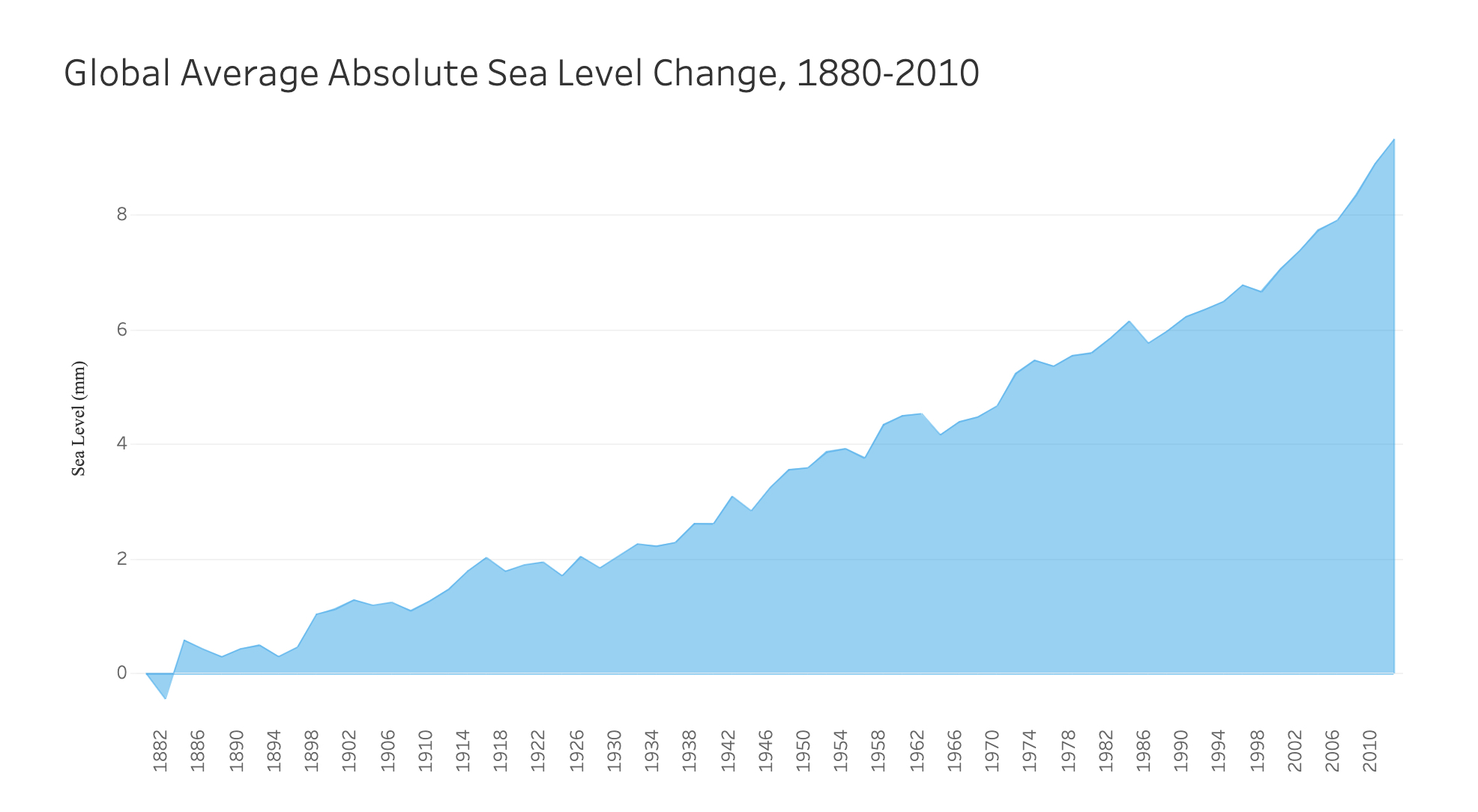
Chart made in Tableau. Date source: EPA (United States Environmental Protection Agency) and CSIRO (Commonwealth Scientific and Industrial Research Organization) / Data Hub.
Thousands of people have already been forced to leave their homes as
climate refugees and environmental migrants due to rising seas and
extreme flooding. Katherina Hayhoe explained it best in an essay for
All We Can Save: Truth, Courage, and Solutions for the Climate
Crisis
edited by Marine Biologist and climate activist Ayana Elizabeth Johnson.
Hayhoe wrote, “It’s increasingly urgent that we understand the tangible
impacts climate change is having on our lives today and how it affects
the things that matter to us (p.107).”
The following maps show how sea level rise is affecting the state of Hawai'i and how it could have devastating impacts on the state's economy if more action is not taken.
The following maps show how sea level rise is affecting the state of Hawai'i and how it could have devastating impacts on the state's economy if more action is not taken.
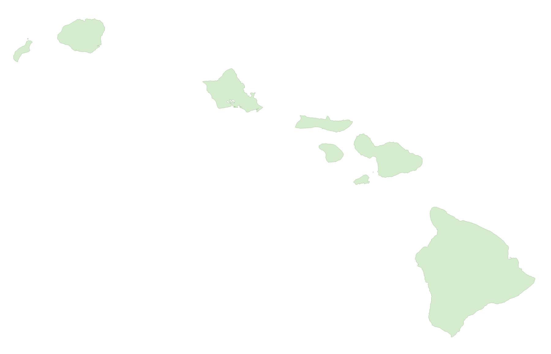
O'AHU
Locals and mainlanders alike have lived in harmony with Hawai'i’s coasts for centuries, adapting to the natural ebb and flow of tides and surges. The seasonal swells are what cause wave breaks to occur at different times of the year and shifting beach depths are expected. But in the last century the balance has turned. The North Shore of O'ahu, home to the world famous Banzai Pipeline wave, has seen years of coastal erosion and elevated tides. Sunset Beach, where the annual Billabong Pipe Masters surf competition is held, changes in size throughout the year but is progressively shrinking. Nearby beaches have also been shrinking to the extent that a handful of million dollar homes are at risk of falling into the water (locals named a surf spot after them, Monster Mush).
HONOLULU
The story is the same on the southern coast of O'ahu in Hawai'i's capital city. In addition to being the center of government, industry, and entertainment, Honolulu contains some of the busiest beaches. The Hilton Village is located on Kahanamoku Beach down the coast from world famous Waikiki Beach, home of pristine waves, breathtaking views of Diamond Head Crater, and Duke Kahanamoku surfer statue.The map below displays flood hazards zones designated by FEMA. These zones are used by the state to inform flood insurance requirements. The majority of buildings are in area X, where flood insurance is not required. However, Honolulu contains areas VE, AO, and AE, zones of higher coastal flooding risk and the center of Hawai'i's tourism industry.
WAIKIKI BEACH
The next two maps use data of sea level rise (SLR) Exposure areas for projected 0.5, 1.1, 2.0. and 3.2 ft rise. The study took into account potential future exposure of each of the main Hawaiian Islands to multiple coastal hazards as a result of sea level rise. The University of Hawaii Coastal Geology Group combined areas of three chronic flooding hazards: passive flooding, annual high wave flooding, and coastal erosion. The combination of these areas form the sea level rise exposure area, "the projected extent of chronic flooding due to sea level rise."
ECONOMIC IMPACT
Waikiki Beach is the state's largest tourist destination, "generating approxiamtely 42% of the state's visitor industry revenue and is responsible for 8% ($5 billion) of the Gross State Product (WBSIDA, 2020)." A 2016 report by the University of Hawai'i Sea Grant College Program concluded that $2.2 billion U.S. dollars would be lost annually due to a complete erosion of Waikiki Beach. Below this map is an interactive Tableau dashboard in which you can explore the potential economic loss at each SLR area, for each island. The projected timeline of sea level rise can be seen more clearly. Data of tourism revenue for each island came from a report of Hawai’i visitor statistics released by the Hawai’i Tourism Authority in 2019. You may have to sign into Tableau to view the dashboard, but it is set to public.
The above maps paint a bleak picture of the effect of flooding from
rising sea levels on Hawai’i’s economy, but there are many initiatives
and legislation in place and planned to address the problem. A Hawaii
Star Advisor news story from 2019,
Kuhio Beach restoration project in Waikiki is done,
explained that a, "95-foot sandbag groin [sandbar] designed to stabilize
an erosion hotspot" had been completed in front of the famous Duke
Kahanamoku statue. Other projects include the 2021 Waikiki Beach
Maintenence Project, highlighted on the website,
Office of Conservation and Coastal Lands's
and the
Waikiki Beach Special Improvement District Association,
which has a board of directors, a budget, and a mission to restore
Waikiki Beach and provide consistent management for future beach
restoration.
The state itself is taking the initiative to preserve its beaches for the future, but tourists from around the world could benefit from more information about the costs of global carbon emissions and rising seas. So the next time you gaze longingly at your vacation photos from Hawaii, sip a Mai-Tai, or brag to someone that you stayed at the Hilton Hawaiian Village, make sure that you're also tuned into the ongoing climate crisis and efforts that you can take in your private lives.

The state itself is taking the initiative to preserve its beaches for the future, but tourists from around the world could benefit from more information about the costs of global carbon emissions and rising seas. So the next time you gaze longingly at your vacation photos from Hawaii, sip a Mai-Tai, or brag to someone that you stayed at the Hilton Hawaiian Village, make sure that you're also tuned into the ongoing climate crisis and efforts that you can take in your private lives.
Mahalo!
METHODOLOGY & DATA
The research goal of this project was to analyze data to determine how rising sea levels, as a result of climate change, are predicted to affect the Hawai’ian Islands.
The main inspiration for the layout was scrollytelling and clean digital newspaper and magazine articles. The Eruption of Instagram Island written by Joshua Hammer for GQ influenced the narrative style and visualizations: black text on a white background with bold earth tone images. Another source of inspiration was this simple graphic chart from sealevels.org. The color blue was consciously used to denote water and the color green for land. For example, the simple Tableau chart of global sea levels uses one color in a bold hue filled in to evoke the feeling of the ocean. The addition of a third color, purple, was used to highlight that the data referred to something other than just the water level, in this case the potential economic loss at each level.
Just about all of the data used came from the Hawai’i Satewide GIS Program and Office of Plannin’s Geospatial Data Portal. All contents of the site are public domain. Further details about each data source are included in the visualization captions. Most datasets had accompanying metadata reports and extensive descriptions of the data collection and caveats. The statewide GIS program’s goal is to facilitate information sharing between statewide planning and different government agencies. All datasets were available as shapefiles and were manipulated and analyzed in the GIS software, QGIS 3.10. Census tract data was obtained from the United State’s Census Bureau data portal. This CSV data had to be organized and cleaned in Google sheets and saved with metadata python files written in Visual Studio Code. The census tract data was uploaded into QGIS and saved as a shapefile. The tracts were used to create layers for Honolulu and Waikiki to clip statewide and O’ahu files to the smaller areas. The statistics function in QGIS was used to find the sum potential economic loss of each clipped layer.
Process
All three QGIS maps provide a visual of potential flood areas as a result of sea level rise. The purpose of MAP 1 is to show an overview of O’ahu and to situate the user from the above map of the entire island chain. This data is coastal flood zone with 3.2 feet Sea Level Rise and three different levels based on different wave heights. This is the only visual of this particular dataset because it is straightforward but still too detailed to be understood in the context of the story. It serves only as an introductory visual. The basemap is an elevation map made in MapBox studio. The QGIS process involved separating the layer by zone, selecting each to save as an individual layer, then assigning graduated colors to each. The first attempt at an interesting visualization was to do several merge processes: zones 1+2, and zones 1+2+3 so that they layered atop each other. Each new zone was assigned the same color at the same 50% opacity to show the layers, but soon it was determined that this process was ineffective because the three different zones did not layer successively, so the distinction between each zone was unclear. The next attempt colored each layer a different huge of blue to infer a graduated scale.QGIS
Maps 2 and 3 focus on the Waikiki Beach area to tell a specific story about a small area that influences the entire state. Data used: SLR (sea level rise) Exposure Area for 0.5, 1.1, 2.0, and 3.2 ft scenarios, address points, potential economic loss at all four scenarios, and census tax lots. The tax lots add subtle dimension to the basemap. Each exposure area was clipped to Waikiki and assigned a graduated color. The Honolulu layers were assigned paler tones of the colors. Opacity was experimented with but the layers did not combine in a way to make that work. Then, the address points were clipped to each layer, new fields were created with the number of address points within each layer (found through the statistics function), then another field was created with a calculation to find the percent density of each layer. To determine potential economic loss for each layer in Waikiki alone, each economic loss layer was clipped to the corresponding Waikiki SLR layer. Then the sum was found through the statistics function. It sounds simple but it took at least ten hours until the result was satisfactory.CARTO
The purpose of the Carto map is to provide an interactive tool to discover details analyzed for each SLR exposure area. The entire island chain is included so that the user, if they are not familiar with Hawai’i, understand where O’ahu is located. Each of the four SLR areas is applied statewide. It was not possible to include address point and potential economic loss data statewide because the files were too large, so they were included only for Honolulu (address points) and Waikiki (address points and econ loss). Similarly, annual tourism revenue data was not found for Honolulu. Percentage of state tourism revenue from 2019 was calculated for both O’ahu and Waikiki. The percentage was calculated in QGIS. The same economic loss for each Waikiki SLR area from the static QGIS maps was included for this interactive Carto map.TABLEAU
The Tableau layout was included as a way to display the depth of skills learned and the variety of ways that this data can be analyzed and visualized. There were no new datasets added, but they were expanded to include the other islands. A Google sheet spreadsheet was made from the SLR economic loss data and imported into Tableau, then separated by SLR level and island. The hover highlight effect was more of a personal indulgence to see if I could apply it. It’s also an interesting way to show change over time. A good improvement would be to edit the revenue ($) scales to match so that the variation between each SLR level is more apparent upon first glance.USER RESEARCH
User research conducted involved observation and interviews with three different users. User 1 is 60+ years old with limited data experience. User 2 is 40 with extensive design and artistic experience. User 3 is 25-35 and studied user experience and data visualization.User 1 commented that the sea level rise chart would be clearer if the years 1882 and 1982 were in bold typeface to show a 100 year range more instinctually. I was not able to make that change in Tableau. Reactions from User 1 influenced me to change the color of the hotel icons in Map 3: potential economic loss. User 1 also made a lot of subtle comments that convinced me to edit to the story text and write in a more straightforward and clear way. Afterall, my intended audience is the general public.
User 2 had a lot of feedback about a map that I ended up removing from the final story because there were too many questions and it did not fit into the larger data purpose. User 2 viewed the webpage on a mobile device and shared that it was legible, most elements were lined up, and was user-friendly in that they could zoom into the visuals and maps. The site includes JavaScript code to ease this transition to mobile devices, but it is always nice to received confirmation that it works for other users.
User 3 did not have much to say when looking at the story, but did mention that the legend of MAP 1 should be in one place instead of scattered around the island. I made that change and agree that it is easier to read and still looks interesting.
Other feedback included visualization and color notes. There was a comment that the map legends would make more sense if the measurements went up instead of down, to portray sea level rise. Additionally, the basemap of MAP 1 was changed to a more subtle color palette and in turn is more detailed and tells more information. Prior to the current basemap, which was made in Mapbox studio, there was an elevation range layer in grey tone. The comment was that the grey tones were distracting from the point of the map, which is the flood zones. The new Mapbox basemap is more subtle in color and fades into the background better while still conveying elevation on the island. Other feedback was about the SLR color choices. I had initially colored the layers based on sea level rise amount, but the feedback was that it would make more sense if the colors were based on the projected timeline of the estimated SLR values. This involves a storytelling choice, but due to multiple comments I changed the colors so that the darker color meant sooner impact. There were also contradicting comments about the inclusion of the small corner maps of the larger land area. Some users were familiar with Hawai’i and thought the inclusion was redundant, but others were confused about the location on the map and felt that I needed to include more. Ultimately, I included more spatial orientation images and changed the colors to blend better.
RESULTS & REFLECTION
As a result of this analysis and multiple mediums of visualizations, the findings show that if sea levels continue to rise unmitigated then the impact to Hawai'i’s tourism industry will be near catastrophic for the state’s economy. With more complete data, such as building footprints and how many locals work in Waikiki, more detailed analysis could have been conducted. The results still tell a straightforward story that conveys the importance of ongoing planning and legislation to 1) cut back on carbon emissions as much as possible, and 2) build up Waikiki’s (and the rest of the state’s) beaches. There's a trend that the wealthy general public only takes action to support climate legisltion when their privileged lives and fancy vacations are threatened. Maybe a story like this, presented in simple visuals and text could open more eyes.
ADDITIONAL REFERENCES
- All Hawai'i data shapefiles from Hawai'i Statewide GIS Program | Geospatial Data Portal
- Global Average Absolute Sea Level Change data | Data Hub
- Hawai'i Sea Level Rise Vulnerability and Adaptation Report | Report PDF.
- Intergovernmental Panel on Climate Change (IPCC) Summary for Policy Makers | Synthesis Report.
- NOAA: Climate Change, Global Sea Level |climate.gov.
- RCP8.5 Global Warming Scenario explained |CarbonBrief.org.
- Economic Impact Analysis of the Potential Erosion of Waikiki Beach, 2016 | Report PDF.
- WBSIDA: Waikiki Beach Special Improvement District Association | Background.
- U.S. Census tract data |Data Portal
- Hawai'i Visitor Statistics, 2019 |Hawai'i Tourism Authority.